Help us direct you to the right place to sign up

SKIP AHEAD TO:
Monitor market trends, generate actionable insights, enhance client presentations, and find relevant comps to inform your deals with our CRE data visualization and analytics dashboard.
Overview
Over the last 8 years, CompStak’s database has grown to include over 1.8M lease and sales comps across all U.S. markets. Most of these comps contain 20+ data points crucial to our members’ work — for example, over 75% of our lease comps have net effective rent figures and the underlying concession terms.
This abundant, accurate data has given our members an edge in their business objectives, from identifying potential clients to in-depth market research to negotiating deals.
The next logical step was to visualize all this data we’ve collected!
Our goal was to provide our members with a powerful tool that uses our crowdsourced data to paint the most balanced and accurate market picture — for both CRE professionals and the clients they serve.
Today, we are excited to announce the new CompStak Exchange Market Dashboard — a powerful commercial real estate data visualization and analytics tool that shows you all the core market vitals at a glance.
The dashboard compiles graphs and charts that CRE professionals find most useful for their workflows:
- Averages for the key market indicators & rents over time
- Tenant industry heat maps & the relative distribution
- Lease expiration charts by submarket & property types
- …and more!
These charts can be used for market research, pitches or presentations, uncovering market insights, and more — the Market Dashboard serves as the ultimate insights tool to help CRE professionals get ahead of the competition and position themselves as market experts.
You will be able to answer questions such as:
- Would it make sense for my client to relocate to a building of similar quality but in a less expensive neighborhood?
- Where is my market heading? How did it perform under similar conditions in the past?
- What are the submarkets to look into for a law firm that specializes in media and wants to be near their clients?
Want a sneak peek now? Read on below!
The dashboard and all its contents will be available to all existing members of CompStak Exchange — the free CompStak platform created exclusively for CRE brokers, appraisers, and researchers.
Not a member? Request a free account!
Not a CRE broker/appraiser/researcher? Request a demo for CompStak Enterprise here.

Charts & Graphs
Uncover new insights and gain expanded visibility into market trends —the new dashboard will have charts and graphs available for the following:
- Averages
- Market Rent Heat Map
- Starting Rent
- Lease Expiration by Property Type & Submarket
- Tenant Industry Heat Map & Distribution
Averages
CompStak Exchange members will be able to easily access average values for Market Rent, Net Effective Rent, TI Value, Free Rent, and Term. To make the data more relevant, you can filter by submarket (e.g. Chelsea), property type (e.g. retail), and specify the date range — 6 months, 1 year, or 2 years.
Why use it?
Compare averages over time to predict where the market is heading or educate an existing or prospective client who is entering the market for the first time.
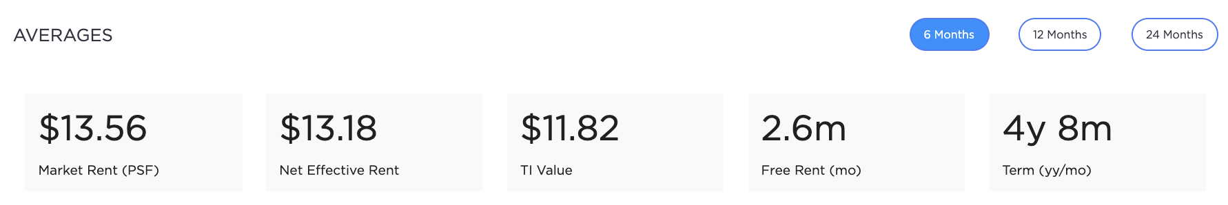
How did the average TI Value for office space in the Financial District over the last 6 months compare to the 2-year average?
Market Rent Heat Map
Our Market Rent Heat Map allows you to visualize starting rents across neighborhoods in your market. This heat map reflects the estimated annual starting rent for office lease transactions (Retail coming soon!).
Why use it?
The Market Rent Heat Map can help you deliver a convincing pitch or support other areas of your day-to-day by providing a macro view of your market. Tenant reps can advise their prospective clients to consider nice, but less expensive neighborhoods. Landlord reps can help set a more realistic asking rent for their client’s space. Researchers can include these heat maps to support commentary or predictions that they’re making in market research reports.
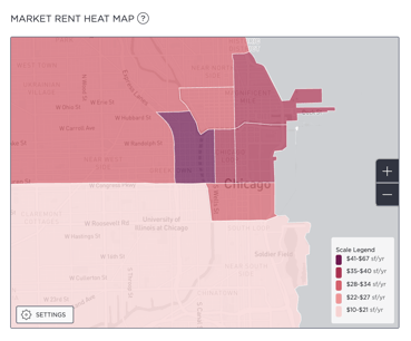
Would it make sense for your client to relocate to a building of similar quality but in a less expensive neighborhood?
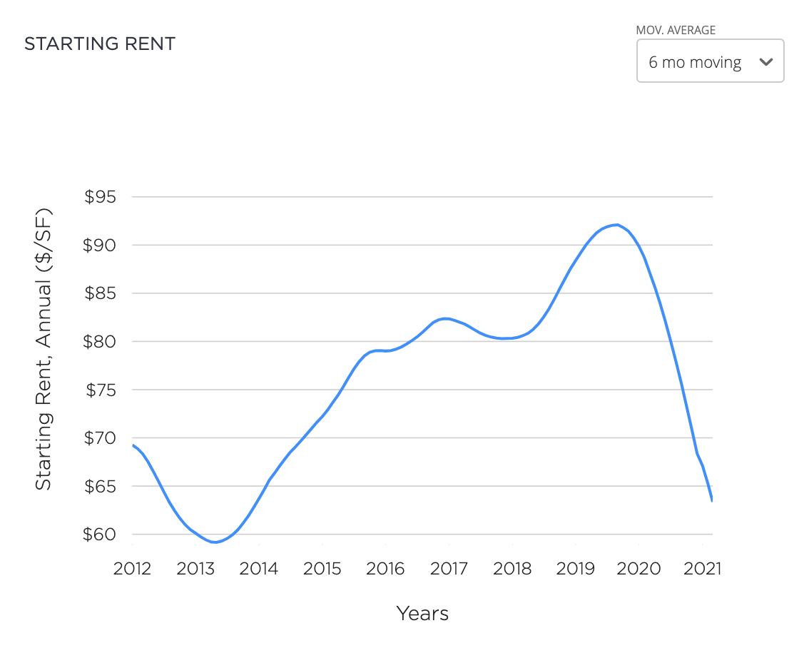
Starting Rent
This chart helps you visualize the starting rent trends in your market. To see the trends over different time periods, you can adjust the moving average by 3, 6, and 12 months.
Why use it?
Use our Starting Rent chart in pitch materials to demonstrate your solid research and understanding of the market. You could also use this chart when educating an existing client on the current state of the market, while writing research reports, or to monitor market trends.
Lease Expiration by Property Type & Submarket
These charts provide a quick visualization of how many commercial spaces are scheduled to expire at any point in the future.
Why use it?
Utilize these charts for prospecting and consulting with your clients.For example, you can help your landlord client understand their position in the market based on their available space and how it lines up against the market as a whole. You can also use the charts to devise a space hunting strategy or determine where to focus your prospecting efforts.
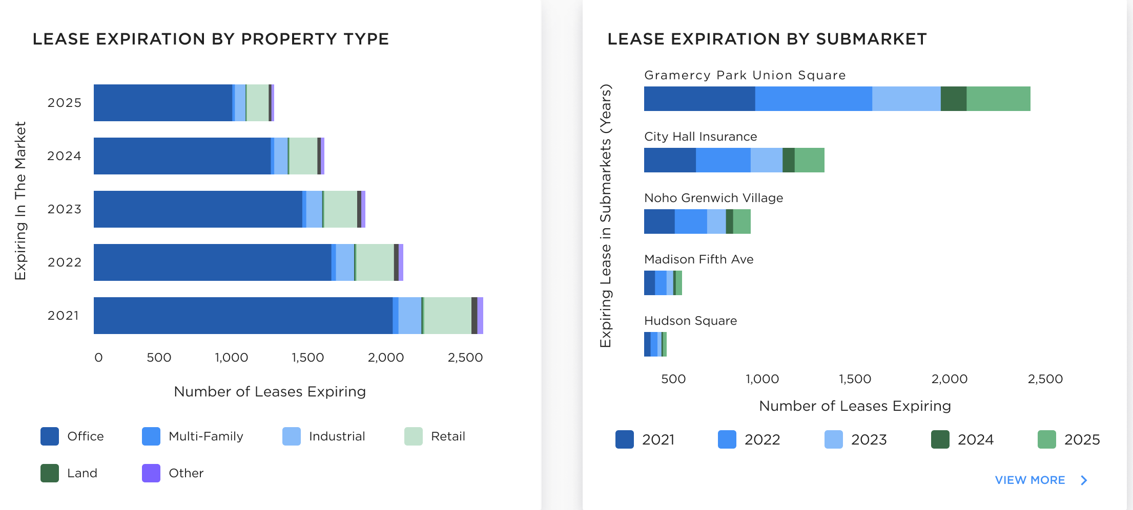
Does your client’s lease expire at the same time a large amount of space is coming onto the market?
Tenant Industry Heat Map & Distribution
Visualize which industries dominate any neighborhood in your market. By looking at the patterns on the heat map, you can see the tenant industry breakdown. The radius of each circle tells you the relative size — the larger the circle, the more square feet an industry occupies.
Why use it?
Tenant industry visualizations are meant to enhance your pitches for prospective clients or fine tune your leasing strategy for an exclusive. For example, a high concentration of tech and media crowd in your neighborhood means your landlord client should probably market creative/open floors as opposed to traditional office space, preferred by law firms. Use these charts for research reports, presentations, or client pitches.
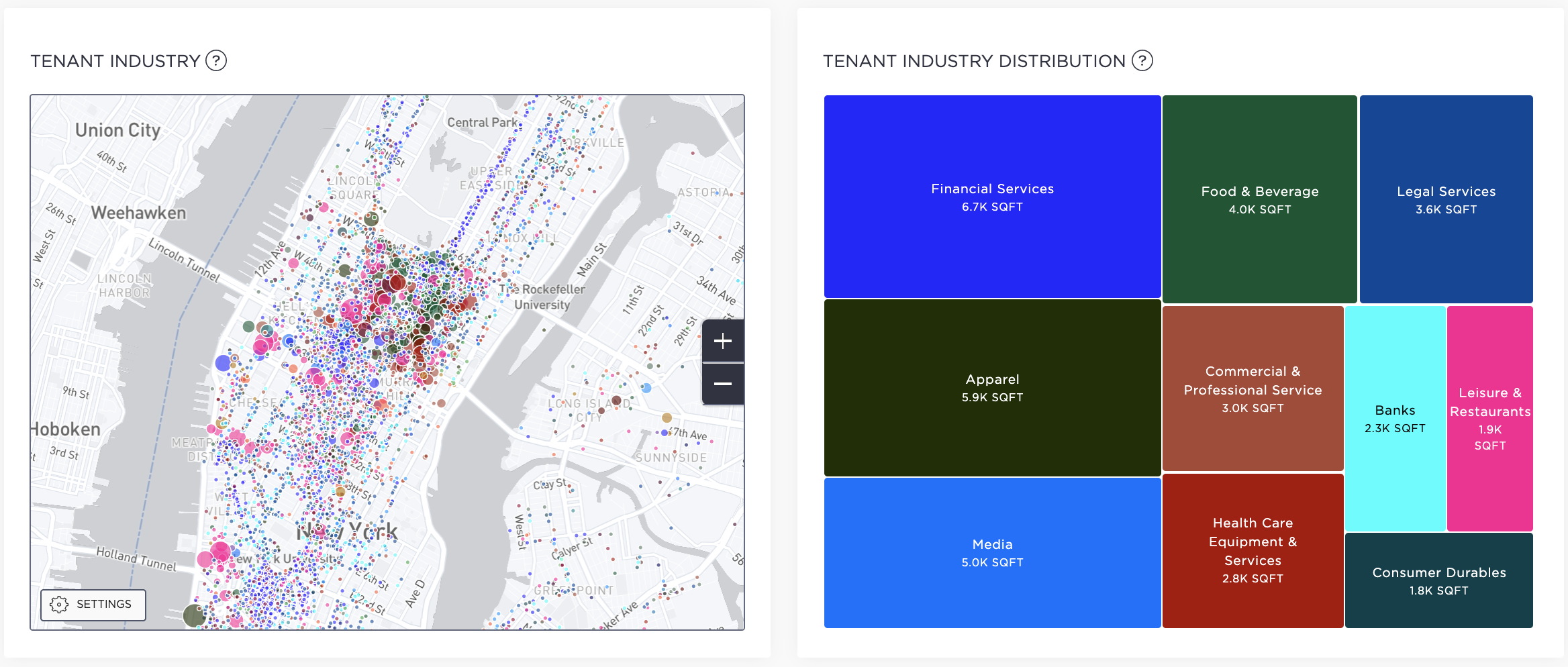 What are the submarkets to look into for a law firm that specializes in media and wants to be near their clients?
Related Posts
Live Q&A Recap with CompStak and Trepp: Upcoming Office Loan Maturities, Large Lease Expirations, and Anemic Space Demand—the Perfect Storm?

Live Q&A Recap with CompStak and Trepp: Upcoming Office Loan Maturities, Large Lease Expirations, and Anemic Space Demand—the Perfect Storm?
Product Update: The Full Picture with Multifamily Data

